Limited Offer – Just $97!
Design Stunning Social Media
with Canva
Imagine having social graphics and videos that WOW your audience and stop them from scrolling…
Imagine having social graphics and videos that wow your audience and stop them from scrolling.
This workshop will do wonders for your brand! Imagine having social graphics and videos that wow your audience and stop them from scrolling.
Insta-fabulous carousels and stories people swerve over for.
Reels & TikToks so so strategically crafted that people share them all over.
That’s how you get your audience's attention. And now, you don't have to be a pro designer to do it.
Insta-amazing carousels and stories everyone swerves over for.
This workshop will do wonders for your brand! Imagine having social graphics and videos that wow your audience and stop them from scrolling.
Insta-fabulous carousels and stories people swerve over for.
Reels & TikToks so so strategically crafted that people share them all over.
That’s how you get your audience's attention. And now, you don't have to be a pro designer to do it.
Reels & TikToks so so strategically crafted that people share them all over the web.
This workshop will do wonders for your brand! Imagine having social graphics and videos that wow your audience and stop them from scrolling.
Insta-fabulous carousels and stories people swerve over for.
Reels & TikToks so so strategically crafted that people share them all over.
That’s how you get your audience's attention. And now, you don't have to be a pro designer to do it.
That’s how you get your audience's attention.
And now, you don't have to be a pro designer to do it!
This workshop will do wonders for your brand! Imagine having social graphics and videos that wow your audience and stop them from scrolling.
Imagine having social graphics and videos that wow your audience and stop them from scrolling.
This workshop will do wonders for your brand! Imagine having social graphics and videos that wow your audience and stop them from scrolling.
Insta-fabulous carousels and stories people swerve over for.
Reels & TikToks so so strategically crafted that people share them all over.
That’s how you get your audience's attention. And now, you don't have to be a pro designer to do it.
Insta-amazing carousels and stories everyone swerves over for.
This workshop will do wonders for your brand! Imagine having social graphics and videos that wow your audience and stop them from scrolling.
Insta-fabulous carousels and stories people swerve over for.
Reels & TikToks so so strategically crafted that people share them all over.
That’s how you get your audience's attention. And now, you don't have to be a pro designer to do it.
Reels & TikToks so so strategically crafted that people share them all over the web.
This workshop will do wonders for your brand! Imagine having social graphics and videos that wow your audience and stop them from scrolling.
Insta-fabulous carousels and stories people swerve over for.
Reels & TikToks so so strategically crafted that people share them all over.
That’s how you get your audience's attention. And now, you don't have to be a pro designer to do it.
That’s how you get your audience's attention.
And now, you don't have to be a pro designer to do it!
Insta-fabulous carousels and stories people swerve over for.
Imagine having social graphics and videos that wow your audience and stop them from scrolling.
This workshop will do wonders for your brand! Imagine having social graphics and videos that wow your audience and stop them from scrolling.
Insta-fabulous carousels and stories people swerve over for.
Reels & TikToks so so strategically crafted that people share them all over.
That’s how you get your audience's attention. And now, you don't have to be a pro designer to do it.
Insta-amazing carousels and stories everyone swerves over for.
This workshop will do wonders for your brand! Imagine having social graphics and videos that wow your audience and stop them from scrolling.
Insta-fabulous carousels and stories people swerve over for.
Reels & TikToks so so strategically crafted that people share them all over.
That’s how you get your audience's attention. And now, you don't have to be a pro designer to do it.
Reels & TikToks so so strategically crafted that people share them all over the web.
This workshop will do wonders for your brand! Imagine having social graphics and videos that wow your audience and stop them from scrolling.
Insta-fabulous carousels and stories people swerve over for.
Reels & TikToks so so strategically crafted that people share them all over.
That’s how you get your audience's attention. And now, you don't have to be a pro designer to do it.
That’s how you get your audience's attention.
And now, you don't have to be a pro designer to do it!
Reels & TikToks so so strategically crafted that people share them all over.
Imagine having social graphics and videos that wow your audience and stop them from scrolling.
This workshop will do wonders for your brand! Imagine having social graphics and videos that wow your audience and stop them from scrolling.
Insta-fabulous carousels and stories people swerve over for.
Reels & TikToks so so strategically crafted that people share them all over.
That’s how you get your audience's attention. And now, you don't have to be a pro designer to do it.
Insta-amazing carousels and stories everyone swerves over for.
This workshop will do wonders for your brand! Imagine having social graphics and videos that wow your audience and stop them from scrolling.
Insta-fabulous carousels and stories people swerve over for.
Reels & TikToks so so strategically crafted that people share them all over.
That’s how you get your audience's attention. And now, you don't have to be a pro designer to do it.
Reels & TikToks so so strategically crafted that people share them all over the web.
This workshop will do wonders for your brand! Imagine having social graphics and videos that wow your audience and stop them from scrolling.
Insta-fabulous carousels and stories people swerve over for.
Reels & TikToks so so strategically crafted that people share them all over.
That’s how you get your audience's attention. And now, you don't have to be a pro designer to do it.
That’s how you get your audience's attention.
And now, you don't have to be a pro designer to do it!
That’s how you get your audience's attention. And now, you don't have to be a pro designer to do it.
Imagine having social graphics and videos that wow your audience and stop them from scrolling.
This workshop will do wonders for your brand! Imagine having social graphics and videos that wow your audience and stop them from scrolling.
Insta-fabulous carousels and stories people swerve over for.
Reels & TikToks so so strategically crafted that people share them all over.
That’s how you get your audience's attention. And now, you don't have to be a pro designer to do it.
Insta-amazing carousels and stories everyone swerves over for.
This workshop will do wonders for your brand! Imagine having social graphics and videos that wow your audience and stop them from scrolling.
Insta-fabulous carousels and stories people swerve over for.
Reels & TikToks so so strategically crafted that people share them all over.
That’s how you get your audience's attention. And now, you don't have to be a pro designer to do it.
Reels & TikToks so so strategically crafted that people share them all over the web.
This workshop will do wonders for your brand! Imagine having social graphics and videos that wow your audience and stop them from scrolling.
Insta-fabulous carousels and stories people swerve over for.
Reels & TikToks so so strategically crafted that people share them all over.
That’s how you get your audience's attention. And now, you don't have to be a pro designer to do it.
That’s how you get your audience's attention.
And now, you don't have to be a pro designer to do it!
Amazing carousels and stories everyone swerves over for…
Imagine having social graphics and videos that wow your audience and stop them from scrolling.
This workshop will do wonders for your brand! Imagine having social graphics and videos that wow your audience and stop them from scrolling.
Insta-fabulous carousels and stories people swerve over for.
Reels & TikToks so so strategically crafted that people share them all over.
That’s how you get your audience's attention. And now, you don't have to be a pro designer to do it.
Insta-amazing carousels and stories everyone swerves over for.
This workshop will do wonders for your brand! Imagine having social graphics and videos that wow your audience and stop them from scrolling.
Insta-fabulous carousels and stories people swerve over for.
Reels & TikToks so so strategically crafted that people share them all over.
That’s how you get your audience's attention. And now, you don't have to be a pro designer to do it.
Reels & TikToks so so strategically crafted that people share them all over the web.
This workshop will do wonders for your brand! Imagine having social graphics and videos that wow your audience and stop them from scrolling.
Insta-fabulous carousels and stories people swerve over for.
Reels & TikToks so so strategically crafted that people share them all over.
That’s how you get your audience's attention. And now, you don't have to be a pro designer to do it.
That’s how you get your audience's attention.
And now, you don't have to be a pro designer to do it!
This workshop will do wonders for your brand! Imagine having social graphics and videos that wow your audience and stop them from scrolling.
Imagine having social graphics and videos that wow your audience and stop them from scrolling.
This workshop will do wonders for your brand! Imagine having social graphics and videos that wow your audience and stop them from scrolling.
Insta-fabulous carousels and stories people swerve over for.
Reels & TikToks so so strategically crafted that people share them all over.
That’s how you get your audience's attention. And now, you don't have to be a pro designer to do it.
Insta-amazing carousels and stories everyone swerves over for.
This workshop will do wonders for your brand! Imagine having social graphics and videos that wow your audience and stop them from scrolling.
Insta-fabulous carousels and stories people swerve over for.
Reels & TikToks so so strategically crafted that people share them all over.
That’s how you get your audience's attention. And now, you don't have to be a pro designer to do it.
Reels & TikToks so so strategically crafted that people share them all over the web.
This workshop will do wonders for your brand! Imagine having social graphics and videos that wow your audience and stop them from scrolling.
Insta-fabulous carousels and stories people swerve over for.
Reels & TikToks so so strategically crafted that people share them all over.
That’s how you get your audience's attention. And now, you don't have to be a pro designer to do it.
That’s how you get your audience's attention.
And now, you don't have to be a pro designer to do it!
Insta-fabulous carousels and stories people swerve over for.
Imagine having social graphics and videos that wow your audience and stop them from scrolling.
This workshop will do wonders for your brand! Imagine having social graphics and videos that wow your audience and stop them from scrolling.
Insta-fabulous carousels and stories people swerve over for.
Reels & TikToks so so strategically crafted that people share them all over.
That’s how you get your audience's attention. And now, you don't have to be a pro designer to do it.
Insta-amazing carousels and stories everyone swerves over for.
This workshop will do wonders for your brand! Imagine having social graphics and videos that wow your audience and stop them from scrolling.
Insta-fabulous carousels and stories people swerve over for.
Reels & TikToks so so strategically crafted that people share them all over.
That’s how you get your audience's attention. And now, you don't have to be a pro designer to do it.
Reels & TikToks so so strategically crafted that people share them all over the web.
This workshop will do wonders for your brand! Imagine having social graphics and videos that wow your audience and stop them from scrolling.
Insta-fabulous carousels and stories people swerve over for.
Reels & TikToks so so strategically crafted that people share them all over.
That’s how you get your audience's attention. And now, you don't have to be a pro designer to do it.
That’s how you get your audience's attention.
And now, you don't have to be a pro designer to do it!
Reels & TikToks so so strategically crafted that people share them all over.
Imagine having social graphics and videos that wow your audience and stop them from scrolling.
This workshop will do wonders for your brand! Imagine having social graphics and videos that wow your audience and stop them from scrolling.
Insta-fabulous carousels and stories people swerve over for.
Reels & TikToks so so strategically crafted that people share them all over.
That’s how you get your audience's attention. And now, you don't have to be a pro designer to do it.
Insta-amazing carousels and stories everyone swerves over for.
This workshop will do wonders for your brand! Imagine having social graphics and videos that wow your audience and stop them from scrolling.
Insta-fabulous carousels and stories people swerve over for.
Reels & TikToks so so strategically crafted that people share them all over.
That’s how you get your audience's attention. And now, you don't have to be a pro designer to do it.
Reels & TikToks so so strategically crafted that people share them all over the web.
This workshop will do wonders for your brand! Imagine having social graphics and videos that wow your audience and stop them from scrolling.
Insta-fabulous carousels and stories people swerve over for.
Reels & TikToks so so strategically crafted that people share them all over.
That’s how you get your audience's attention. And now, you don't have to be a pro designer to do it.
That’s how you get your audience's attention.
And now, you don't have to be a pro designer to do it!
That’s how you get your audience's attention. And now, you don't have to be a pro designer to do it.
Imagine having social graphics and videos that wow your audience and stop them from scrolling.
This workshop will do wonders for your brand! Imagine having social graphics and videos that wow your audience and stop them from scrolling.
Insta-fabulous carousels and stories people swerve over for.
Reels & TikToks so so strategically crafted that people share them all over.
That’s how you get your audience's attention. And now, you don't have to be a pro designer to do it.
Insta-amazing carousels and stories everyone swerves over for.
This workshop will do wonders for your brand! Imagine having social graphics and videos that wow your audience and stop them from scrolling.
Insta-fabulous carousels and stories people swerve over for.
Reels & TikToks so so strategically crafted that people share them all over.
That’s how you get your audience's attention. And now, you don't have to be a pro designer to do it.
Reels & TikToks so so strategically crafted that people share them all over the web.
This workshop will do wonders for your brand! Imagine having social graphics and videos that wow your audience and stop them from scrolling.
Insta-fabulous carousels and stories people swerve over for.
Reels & TikToks so so strategically crafted that people share them all over.
That’s how you get your audience's attention. And now, you don't have to be a pro designer to do it.
That’s how you get your audience's attention.
And now, you don't have to be a pro designer to do it!
Reels & TikToks so strategically crafted that people can't help but share them everywhere…
Imagine having social graphics and videos that wow your audience and stop them from scrolling.
This workshop will do wonders for your brand! Imagine having social graphics and videos that wow your audience and stop them from scrolling.
Insta-fabulous carousels and stories people swerve over for.
Reels & TikToks so so strategically crafted that people share them all over.
That’s how you get your audience's attention. And now, you don't have to be a pro designer to do it.
Insta-amazing carousels and stories everyone swerves over for.
This workshop will do wonders for your brand! Imagine having social graphics and videos that wow your audience and stop them from scrolling.
Insta-fabulous carousels and stories people swerve over for.
Reels & TikToks so so strategically crafted that people share them all over.
That’s how you get your audience's attention. And now, you don't have to be a pro designer to do it.
Reels & TikToks so so strategically crafted that people share them all over the web.
This workshop will do wonders for your brand! Imagine having social graphics and videos that wow your audience and stop them from scrolling.
Insta-fabulous carousels and stories people swerve over for.
Reels & TikToks so so strategically crafted that people share them all over.
That’s how you get your audience's attention. And now, you don't have to be a pro designer to do it.
That’s how you get your audience's attention.
And now, you don't have to be a pro designer to do it!
This workshop will do wonders for your brand! Imagine having social graphics and videos that wow your audience and stop them from scrolling.
Imagine having social graphics and videos that wow your audience and stop them from scrolling.
This workshop will do wonders for your brand! Imagine having social graphics and videos that wow your audience and stop them from scrolling.
Insta-fabulous carousels and stories people swerve over for.
Reels & TikToks so so strategically crafted that people share them all over.
That’s how you get your audience's attention. And now, you don't have to be a pro designer to do it.
Insta-amazing carousels and stories everyone swerves over for.
This workshop will do wonders for your brand! Imagine having social graphics and videos that wow your audience and stop them from scrolling.
Insta-fabulous carousels and stories people swerve over for.
Reels & TikToks so so strategically crafted that people share them all over.
That’s how you get your audience's attention. And now, you don't have to be a pro designer to do it.
Reels & TikToks so so strategically crafted that people share them all over the web.
This workshop will do wonders for your brand! Imagine having social graphics and videos that wow your audience and stop them from scrolling.
Insta-fabulous carousels and stories people swerve over for.
Reels & TikToks so so strategically crafted that people share them all over.
That’s how you get your audience's attention. And now, you don't have to be a pro designer to do it.
That’s how you get your audience's attention.
And now, you don't have to be a pro designer to do it!
Insta-fabulous carousels and stories people swerve over for.
Imagine having social graphics and videos that wow your audience and stop them from scrolling.
This workshop will do wonders for your brand! Imagine having social graphics and videos that wow your audience and stop them from scrolling.
Insta-fabulous carousels and stories people swerve over for.
Reels & TikToks so so strategically crafted that people share them all over.
That’s how you get your audience's attention. And now, you don't have to be a pro designer to do it.
Insta-amazing carousels and stories everyone swerves over for.
This workshop will do wonders for your brand! Imagine having social graphics and videos that wow your audience and stop them from scrolling.
Insta-fabulous carousels and stories people swerve over for.
Reels & TikToks so so strategically crafted that people share them all over.
That’s how you get your audience's attention. And now, you don't have to be a pro designer to do it.
Reels & TikToks so so strategically crafted that people share them all over the web.
This workshop will do wonders for your brand! Imagine having social graphics and videos that wow your audience and stop them from scrolling.
Insta-fabulous carousels and stories people swerve over for.
Reels & TikToks so so strategically crafted that people share them all over.
That’s how you get your audience's attention. And now, you don't have to be a pro designer to do it.
That’s how you get your audience's attention.
And now, you don't have to be a pro designer to do it!
Reels & TikToks so so strategically crafted that people share them all over.
Imagine having social graphics and videos that wow your audience and stop them from scrolling.
This workshop will do wonders for your brand! Imagine having social graphics and videos that wow your audience and stop them from scrolling.
Insta-fabulous carousels and stories people swerve over for.
Reels & TikToks so so strategically crafted that people share them all over.
That’s how you get your audience's attention. And now, you don't have to be a pro designer to do it.
Insta-amazing carousels and stories everyone swerves over for.
This workshop will do wonders for your brand! Imagine having social graphics and videos that wow your audience and stop them from scrolling.
Insta-fabulous carousels and stories people swerve over for.
Reels & TikToks so so strategically crafted that people share them all over.
That’s how you get your audience's attention. And now, you don't have to be a pro designer to do it.
Reels & TikToks so so strategically crafted that people share them all over the web.
This workshop will do wonders for your brand! Imagine having social graphics and videos that wow your audience and stop them from scrolling.
Insta-fabulous carousels and stories people swerve over for.
Reels & TikToks so so strategically crafted that people share them all over.
That’s how you get your audience's attention. And now, you don't have to be a pro designer to do it.
That’s how you get your audience's attention.
And now, you don't have to be a pro designer to do it!
That’s how you get your audience's attention. And now, you don't have to be a pro designer to do it.
Imagine having social graphics and videos that wow your audience and stop them from scrolling.
This workshop will do wonders for your brand! Imagine having social graphics and videos that wow your audience and stop them from scrolling.
Insta-fabulous carousels and stories people swerve over for.
Reels & TikToks so so strategically crafted that people share them all over.
That’s how you get your audience's attention. And now, you don't have to be a pro designer to do it.
Insta-amazing carousels and stories everyone swerves over for.
This workshop will do wonders for your brand! Imagine having social graphics and videos that wow your audience and stop them from scrolling.
Insta-fabulous carousels and stories people swerve over for.
Reels & TikToks so so strategically crafted that people share them all over.
That’s how you get your audience's attention. And now, you don't have to be a pro designer to do it.
Reels & TikToks so so strategically crafted that people share them all over the web.
This workshop will do wonders for your brand! Imagine having social graphics and videos that wow your audience and stop them from scrolling.
Insta-fabulous carousels and stories people swerve over for.
Reels & TikToks so so strategically crafted that people share them all over.
That’s how you get your audience's attention. And now, you don't have to be a pro designer to do it.
That’s how you get your audience's attention.
And now, you don't have to be a pro designer to do it!
It's time to grab your customer's attention. And now, you don't have to be a pro designer to do it!
Imagine having social graphics and videos that wow your audience and stop them from scrolling.
This workshop will do wonders for your brand! Imagine having social graphics and videos that wow your audience and stop them from scrolling.
Insta-fabulous carousels and stories people swerve over for.
Reels & TikToks so so strategically crafted that people share them all over.
That’s how you get your audience's attention. And now, you don't have to be a pro designer to do it.
Insta-amazing carousels and stories everyone swerves over for.
This workshop will do wonders for your brand! Imagine having social graphics and videos that wow your audience and stop them from scrolling.
Insta-fabulous carousels and stories people swerve over for.
Reels & TikToks so so strategically crafted that people share them all over.
That’s how you get your audience's attention. And now, you don't have to be a pro designer to do it.
Reels & TikToks so so strategically crafted that people share them all over the web.
This workshop will do wonders for your brand! Imagine having social graphics and videos that wow your audience and stop them from scrolling.
Insta-fabulous carousels and stories people swerve over for.
Reels & TikToks so so strategically crafted that people share them all over.
That’s how you get your audience's attention. And now, you don't have to be a pro designer to do it.
That’s how you get your audience's attention.
And now, you don't have to be a pro designer to do it!
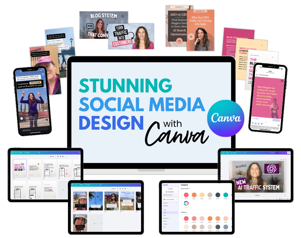
This workshop will do wonders for your brand!
SECTION 1
Your Ideal Canva Workflow
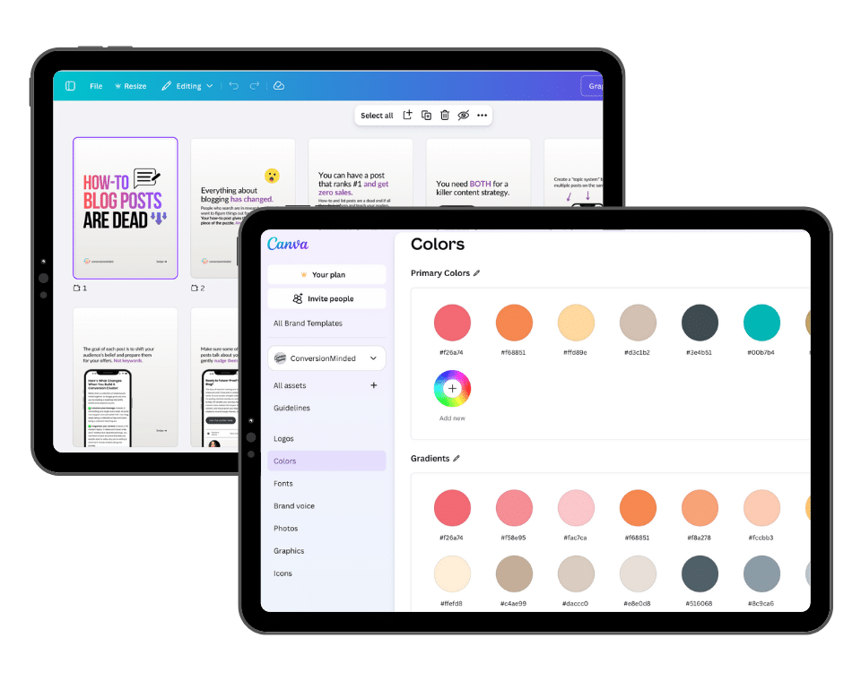
Work quickly and efficiently without getting lost in all that Canva has to offer! I'll show you how to create multiple brand kits, set up projects, folders & brand templates, and how to create teams and groups. I'll also show you how to share files with your teams, social channels, and productivity tools you're already using – plus the Content Planner and Canva apps to power up your designs.
Bonus! Social Media Swipe Files
For founding members only!
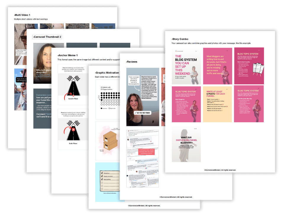
Enroll today and get instant access to all of the designs we'll cover in the workshop, plus a cheat sheet with all the styles arranged into themes so you can view them at a glance for quick scanning.
Enroll today and you'll have 12 carousels, 6 reels, 5 pins, 4 stories, and 3 YouTube thumbnails at your fingertips to start your own designs.
SECTION 2
Peek over my shoulder as I show you how to design…
Carousels
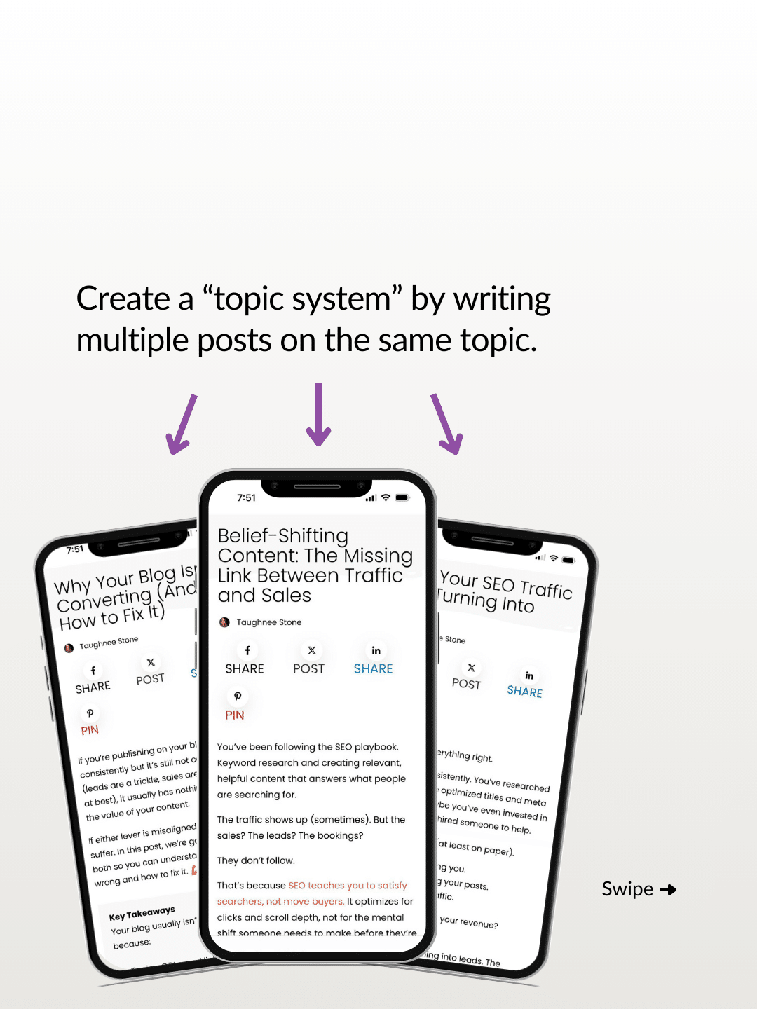
From simple text-based carousels, to one with graphics and photos, learn how to work quickly with frames and simple graphics to make your designs pop, add gradients, layers, create collages, animations, and so much more.




Single Image Posts
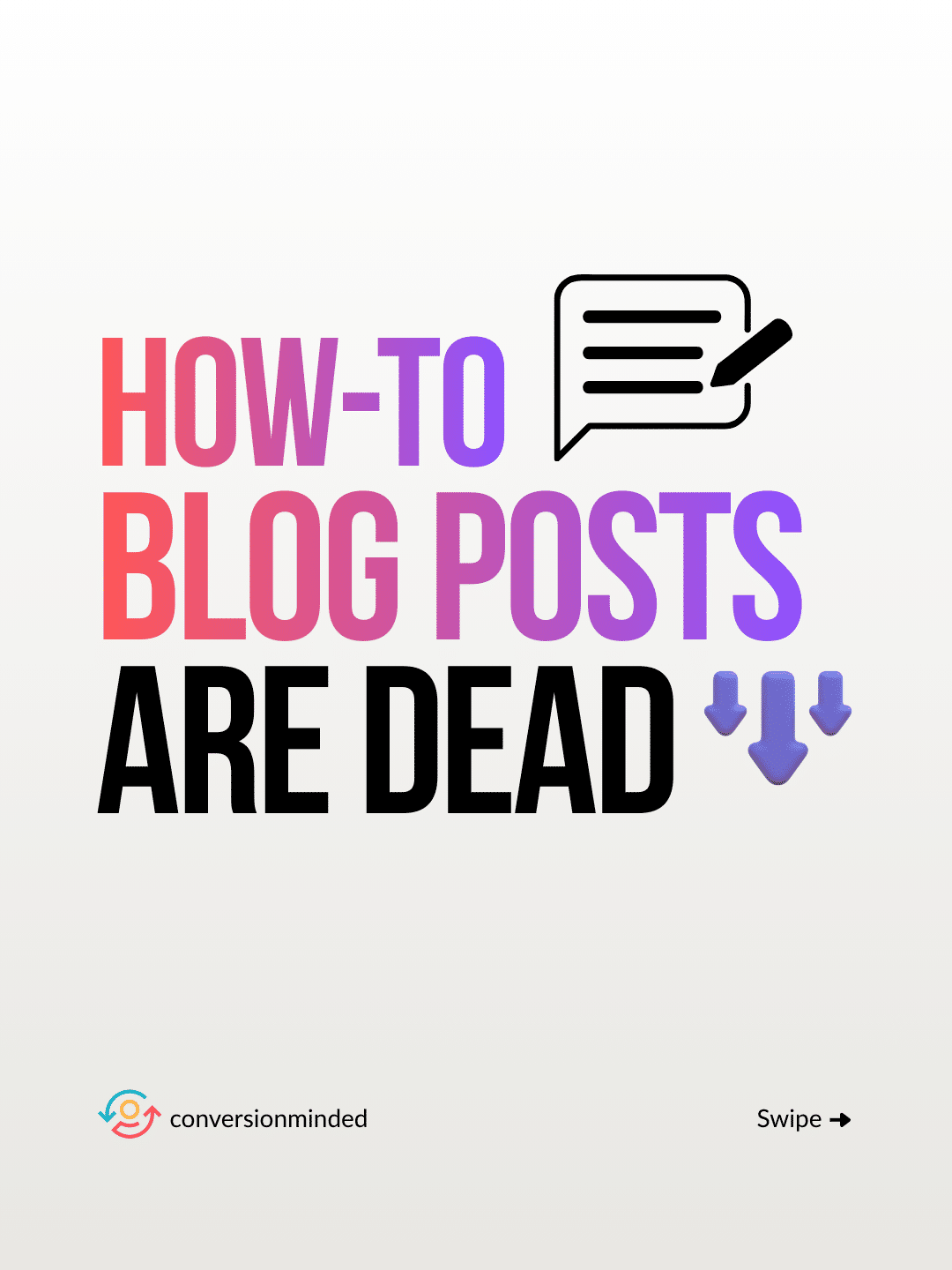
Make your single photos and images pop with layering and font techniques, perfect for ads and promotions!


Reels & TikToks
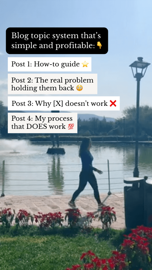
Create builds from simple b-roll style videos with music and transitions that keep people watching to your CTA.



Stories
Learn how to create stories that dazzle your followers, plus the types of stories you need to turn them into customers.


Pins
Create pins that pop and stand out on mobile and desktop, with subtle changes you can make to turn one post into multiple pins that look fresh and exciting.


YouTube Thumbnails
Advanced layering and magic editing tips so your thumbnails really WOW and get the click!


i'll also show you:

The Anatomy of Compelling Design
Discover how to infuse your brand with your unique personality, all while keeping it consistent across all content types and platforms. These tips will have you looking like you have a graphic design pro on your team. And they'll keep your brand looking like a million dollars!

Storytelling Strategies
Thoughtful design is about more than visuals. You need to pair it with copy that commands authority and effortlessly pulls people into your business. I'll show you powerful storytelling formulas that go way beyond simple tips and how-to carousels. Learn hook to people and keep them clicking, even with minimal design and colors.
hey there!
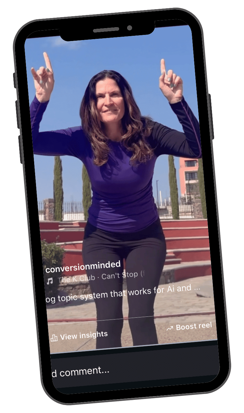
I've always been passionate about the concept of design thinking, and I'm thrilled to share everything I've learned about creating powerful, scroll-stopping visual content with you.
Get access to Social Media Design with Canva!
Have questions? We've got answers!
How is this different from other Design workshops?
Social Media Design with Canva is a comprehensive workshop created by a professional designer and writer, so you'll have endless design strategies along with faster, quicker ways to work inside Canva. This workshop also covers multiple areas, including productivity, design thinking, strategic copywriting and more to make your socials incredibly compelling.
Do I already need to be a designer?
Not at all! The workshop covers high-impact design theories that you can easily implement. Even if graphics and visuals aren't your thing right now, by the time you are done with Canva Social Media Design – and the bonus Canva swipe files if you're a founder – you'll be kicking out social media content that makes your brand look like you have a pro designer on your team.
When will I get access after purchasing?
You'll receive immediate, lifeetime access as soon as you purchase.
Is there a guarantee?
Absolutely. We know you're going to love this workshop and get a ton of value from it, but if you're unhappy with your purchase you can reach out to us at team@conversionminded.com within 7 days of your purchase to request a refund. You will lose your right to use any of the program materials at that time.