
 Color is such a huge part of how we experience the world. Everything we experience is made up of different colors. Some inspire and excite us and others can make us feel a bit down.
So what does this mean for your website and brand?
I think one of the hardest things with color is knowing how to apply it so that your brand stands out without being a freak show of colors. There are so many sites where you can get ideas for color palettes, but then what do you do with them?
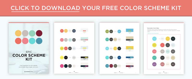
I put together a quick guide and free printable color scheme kit that will help you choose your brand colors with intention and purpose.
Color is such a huge part of how we experience the world. Everything we experience is made up of different colors. Some inspire and excite us and others can make us feel a bit down.
So what does this mean for your website and brand?
I think one of the hardest things with color is knowing how to apply it so that your brand stands out without being a freak show of colors. There are so many sites where you can get ideas for color palettes, but then what do you do with them?
I put together a quick guide and free printable color scheme kit that will help you choose your brand colors with intention and purpose.
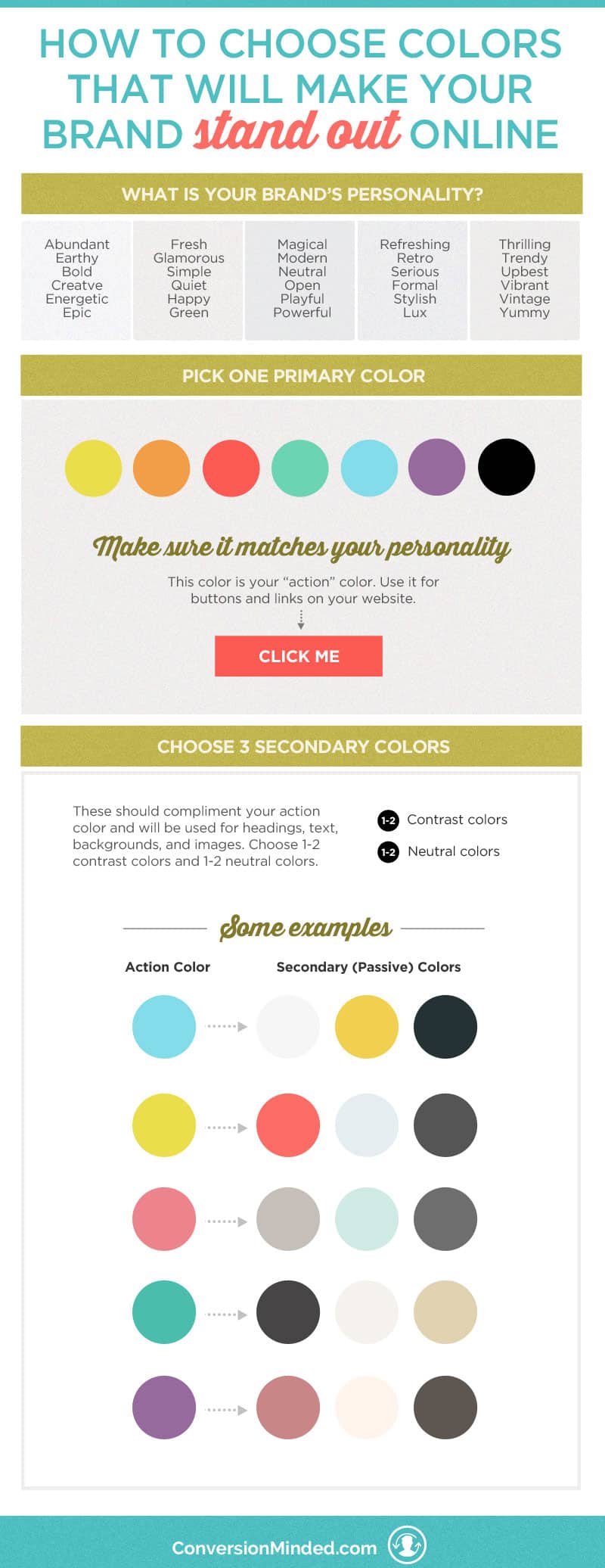
Choose a primary color
The first thing to do if you want to build an epic brand (and of course you do!) is to identify your brand tone. This really means deciding how you want your brand to look, feel, and sound to people. Once you’ve done that, simply assign a color that matches your brand’s tone. Whichever color you choose will become your brand’s primary color. To help you decide, here’s a list of some colors and the moods they evoke:- Red: strong, powerful, fun, youthful, confident, exciting, loud, vibrant
- Orange: friendly, energetic, unique, positive, upbeat, spirited
- Yellow: happy, sunny, enthusiastic, positive, cheery, warm
- Green: calm, refreshing, healthy, green, abundant, natural, motivated
- Blue: open, airy, calm, credible, reliable, safe, serene, trusting, modern
- Purple: creative, lush, luxurious, mysterious, regal, romantic, seductive, sumptuous, wise, powerful, strong, safe, timeless, edgy
- Gray: neutral, boring, depressing
- Beige: neutral, picks up traits of surrounding colors
- Ivory: neutral, clean, simple, easy
Red gets more clicks
You know how a red top makes your shoulders look bigger and a pair of black pants makes your hips look smaller? Color has a lot to do with our visual perceptions of size. If you play with color like this you can make certain elements stand out and grab people’s attention, even when they’re smaller. Red and orange are like this – they get noticed online. They’re “action” colors. They look bigger than they are and grab your attention pretty quickly. People want to click on red and orange. Just look at your Pinterest feed. Which color stands out to you the most?Turn your primary color into an action color
Got it, red stands out more. Buut, what if red or orange doesn’t match your brand personality? Great question! Let’s say your primary color is blue. You can still make it stand out so people notice and click it. You just have to be more careful with how you apply it. When you look at this shopping list, which word do you remember?- Apple
- Orange
- Banana
- Pineapple
- Lemon
- Blueberry
- Strawberry
- Melon
- Kiwi
Compare color palettes
I love creating different color combinations. So much fun! Before you choose your brand’s color scheme, play around with some different color palettes for inspiration. Here are a few sites that I like:- Canva – Want to know what colors are in a photo? With Canva’s color palette generator, you can create color combinations in seconds. Simply upload a photo, and Canva will use the hues in the photo to create your color palette. You can also explore their custom color recommendations for more ideas.
- Coolors – This one is probably my favorite. It’s a color scheme generator that gives you an entirely new set of colors every time you press the space bar. Once you see a palette that includes your primary color, you can tweak the hue and saturation or even choose a different shade to see how that new color looks paired with the others.
- Color Hunt – An open collection started by designers to celebrate the beauty of colors, this site has become a go-to resource for diverse and colorful palettes. Each palette is a public property and not owned by a specific creator, and anyone can create and submit a new color combinations. I love that the color palettes are categorized so you can easily find interesting combination that match your mood and style…from vintage and retro palettes to nature, sunny, and even “happy” palettes like the ones here.

Create your own color scheme
Now that you’ve got some ideas for colors to pair with your action color, the next step is to create your brand’s color scheme. First, a note. It’s fun to experiment with different colors and that’s perfectly okay. At some point, you’ll want to narrow it down to 3-4 colors so your brand doesn’t look all over the place. The most successful brands are strategic and cohesive with their brand elements, and you want to be successful too! So when you think color, think strategy. Some more thoughts on color schemes:- Every color should have a specific purpose. Don’t just choose colors because you think they look pretty together. Of course you want that, but what’s even more important is how you apply colors to your brand elements, e.g. headings, titles, text, icons, buttons, and links.
- As I mentioned before, your action (primary) color is the one you really want to pop. Save this color for your links and buttons.
- Choose 1-2 neutral tones for backgrounds. Neutral tones aren’t necessarily exciting, which is exactly what you want. Neutral colors make your action color stand out. They’re similar to white space in the way they open up your page and break up contrasting colors.
- Choose a contrasting (and darker) color for backgrounds, headings, and text.
- Ideally, your heading color should be different than your action color. This can be tricky depending on your color scheme but is definitely something to keep in mind. If you use the action color only on buttons and links, your readers won’t be confused about what to click on.
 Psst…Colors are just ONE of the many brand elements we cover in The DIY Branding Kit. With this kit you will create an entire branding system that includes all your visual elements (logo, colors, fonts, social media templates, style guide) PLUS brand copy (About page, Home page, messaging, blog tone and style) so you can build a brand that makes you smile. Click on the image below to learn more!


Amazing resource! I just downloaded the kit and can’t wait to check it out. Thank you for providing as a resource!
You’re so welcome!
Love this! Such a helpful resource! This will be a huge help as I continue branding my business. Also signed up for the free resources you provided! Thank you! ?
Awesome! I’m glad you found it helpful.
This was very helpful! Thanks!
Awesome! I was about to make a poster for a fundraiser and this even makes me want to change my first idea of getting a neon yellow poster with regular writing to a grey or white poster with letters that stand out more! Thank you for the advice!
You’re so welcome, Katie. Sometimes it helps to step back and look at the bigger picture with color.
So interesting, I’ve never given much thought to color and the feelings that they create in regards to online content. I especially like learning that red and orange are action colors, that’s very helpful to know!
Awesome! So glad you found the guide helpful.
This is a great source of inspiration! Thank you!!
I’ve never thought of colors in this way before. I use gray on SO much stuff, never realized it’s considered boring and depressing. Oops! Thanks for the tips!
You’re so welcome, Sarah.
This is a great guide, color is very important for branding and selling. The tricky part for me is that the colors I like don’t always seem to be what everyone else likes so it’s hard to find a middle ground.
Hey Rebecca, I really like your colors. Looks like you’re nailing it with your brand.
Great branding tips! My websites primary color is pink!
Love that color!
This is an excellent article, thank you, I really learned a lot!
Now if I could only work out what feelings I want my blog to inspire… I have a lot to think about. Thank you!
You’re so welcome, Rachael.