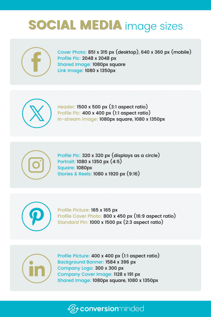
It seems like there are dozens of cheat sheets out there when it comes to social media image sizes, and they often contradict each other. That’s because the dimensions, viewable areas, and requirements for profile pictures, cover photos, and shared images are constantly changing across platforms.
To make your life easier, I put together this fresh, accurate guide with the latest image dimensions for the most-used social networks in 2025. If you see anything that’s out of date, let me know and I’ll update it right away.
My Top Recommended Sizes (2025):
Profile Pics: 400 x 400 px (1:1). Most platforms crop this into a circle.
Cover Photos: Varies by platform (see details below).
Shared + Link Images:
Instagram, LinkedIn, Facebook, X: 1080 x 1080 px (square), 1080 x 1350 px (portrait)
Pinterest: 1000 x 1500 px (2:3 aspect ratio)
When in doubt, use the square or vertical format at 1080px wide. If your blog or brand emphasizes Pinterest, include a tall vertical image inside your post for better performance on the platform.
Facebook Image Sizes
Profile Picture: 2048 x 2048 px (displays at 176 x 176 px on desktop)
Personal Cover Photo: 851 x 315 px (desktop), 640 x 360 px (mobile)
Page Cover Photo: 1958 x 745 px
Group Cover Photo: 1640 x 922 px
Shared Image/Link: 1200 x 630 px
For Facebook profiles, keep in mind that your profile image still overlaps a portion of the lower-left side of your cover photo. If your cover includes important visuals or text, make sure to place them away from this area to keep them visible.
The recommended size for Facebook cover photos is 851 x 315 pixels on desktop. However, mobile displays crop differently—showing a taller version at 640 x 360 pixels, or even up to 828 x 465 pixels in some cases. To ensure your content displays well on both desktop and mobile, design your cover photo at 820 x 461 pixels, and keep essential text and graphics within a safe zone of approximately the center 640 x 312 pixels.

For example, on desktop, only the 315-pixel height is shown, while mobile devices reveal more at the top and bottom—so be sure your design clears both ends.
X Image Sizes
Profile Picture: 400 x 400 px (1:1 aspect ratio)
Header Photo: 1500 x 500 px (3:1 aspect ratio)
In-Stream Image: 1600 x 900 px (16:9 aspect ratio)
For X (formerly Twitter), the recommended size for your header photo is 1500 x 500 pixels, but the visible area will often be cropped to around 1500 x 398 pixels, depending on the device and screen resolution. A portion of your profile picture overlaps the bottom left corner of the header, so be sure to avoid placing any important elements in that area.
Keep in mind that X headers are responsive—their appearance can shift depending on the browser width or screen size. Your profile photo and even parts of the header can move slightly left or right as people resize their browser window or view it on different devices. To keep your design intact, leave generous padding around key elements, especially near the edges and lower-left side.

Instagram Image Sizes
Profile Picture: 320 x 320 px (displays as a circle)
Feed Posts:
Profile Photo: Upload at 320 x 320 px for best quality (displays as 110 x 110 px on mobile).
Square: 1080 x 1080 px (1:1)
Portrait: 1080 x 1350 px (4:5)
Stories & Reels: 1080 x 1920 px (9:16)
Note: Instagram’s profile grid now displays rectangular thumbnails, accommodating vertical content more effectively.
Instagram no longer limits posts to square shapes, so you can post in portrait or landscape formats. The platform still displays images at 1080 pixels wide, but choosing taller dimensions (up to 1350 px) helps your content stand out, especially on mobile devices.
Keep in mind, high-resolution posts are easier for others to screenshot or download. If you’re sharing original work, consider adding subtle branding or a watermark to help protect your content and maintain credit.
Pinterest Image Sizes
Profile Picture: 165 x 165 px
Profile Cover Photo: 800 x 450 px (16:9 aspect ratio)
Standard Pin: 1000 x 1500 px (2:3 aspect ratio)
Note: Pins exceeding a 2:3 aspect ratio may be truncated in the feed.
Pins taller than 1260 pixels are still supported, but keep in mind that anything longer than 1260–2061 px may be cropped in the feed, especially on mobile. For optimal visibility, Pinterest recommends pin sizes of 1000 x 1500 px (2:3 aspect ratio).
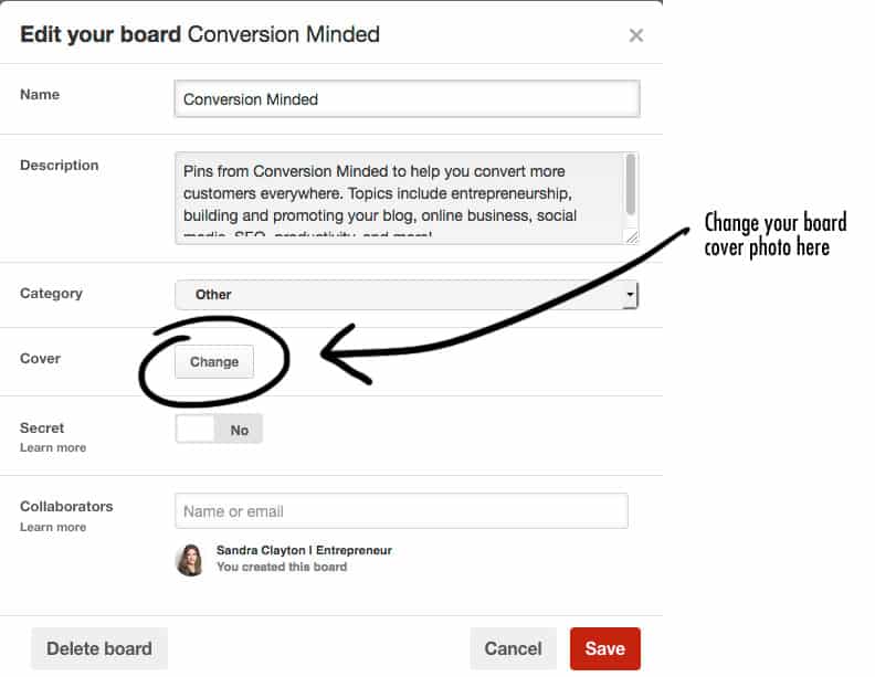
You can create custom board covers to give your profile a cohesive and branded look. While it’s totally optional, custom covers can help users visually navigate your content more easily. If you’ve ever felt frustrated by Pinterest not letting you crop or reposition regular pins just right, this might be your best solution.
Not into that level of customization? No worries—standard pins still work fine as board covers. And if Pinterest ever changes board cover specs again, you won’t be stuck redesigning everything.
Want to give it a try?
Just follow these steps:
- Create a square image sized at 500 x 500 px.
- Add a description and a link back to your website (optional but helpful).
- Save the pin to the board where you want it featured.
- Go to the board settings, and choose the pin you just uploaded as the new cover image.
Where to update the cover:
- Desktop: Go to your board → Click the pencil/edit icon → Click “Change Cover” → Select your custom pin.
- Mobile: Same steps, though the option may appear slightly differently in the UI.

LinkedIn Image Sizes
Profile Picture: 400 x 400 px (1:1 aspect ratio)
Background Banner: 1584 x 396 px
Company Logo: 300 x 300 px
Company Cover Image: 1128 x 191 px
Shared Image: 1080px square or 1080 x 1350 px (vertical)
Just like Facebook and X, LinkedIn’s profile photo and interface elements overlap parts of your background banner, particularly in the middle to lower-left section. The recommended size for your background image is 1584 x 396 pixels.
For Free Accounts:
- The visible safe area is closer to 1584 x 360 px due to interface overlays and potential banner ads at the top.
- Avoid placing key visuals or text in the middle-left and top 70 pixels, which may be obscured by your profile photo and system UI.
For Premium Accounts:
- You get the full 1584 x 396 px height for creative content, with no banner ad overlay. However, your profile picture will still block part of the middle-left, so design accordingly.
Design Tips:
- Keep all key elements (logos, text, CTAs) within the center-top or right side of the banner.
- Leave generous padding around the profile photo area (generally the left 250–400 px).
- Since LinkedIn banners are responsive, they may appear differently depending on screen size or browser width. Stick to clean layouts that scale well.
To avoid layout issues and maintain brand impact, treat LinkedIn banners like flexible canvases: simple, uncluttered, and padded.

Thoughts
Staying up-to-date with social media image sizes can be a daunting task. By using this cheat sheet as a reference and checking back regularly for updates, you can save time and ensure your content looks its best across all platforms. In future posts, we’ll provide guidance on creating templates, batch-designing content, and adding branded watermarks to maintain a polished and consistent brand image.
Feel free to share this 2025 Social Media Image Size Cheat Sheet with your network!


LOVE this! Bookmarked for future reference- I cannot tell you how many times I have googled this!!
Al
Alexandra, so glad you found it helpful! I spent hours googling before I put this together too – thought it might be good to have all the sizes in one place.