How to Use Photoshop to Create Branded Images For Your Blog and Social Media
 I spend so much time creating images for social media and my blog. It’s a big deal to me that my images reflect my brand and are uniquely ME, and at the same time appealing in a way that makes people want to click.
I admit, sometimes I’m better at this than others! When it’s crunch time and I really need to hit that publish button, there are times when my images fall flat. I know it, and boy does it hurt…
I also know that half of your image has ev’rything to do with the blog title (more on titles here). We can create the most beautiful images the sun has ever seen, and if our titles miss the mark our post is going dark on us. That’s the way it goes, right? Sometimes we hit and sometimes we miss…
But I digress, because today it’s graphics tutorial time! I thought it might be fun to get a behind-the-scenes look at how I use Photoshop to create my blog and social media image templates. Woop woop!
Having social media image templates is one of those things that makes your day-to-day so much more productive. No more worrying about what to share on Instagram at the last minute, k?
Here’s what I’m covering in this graphics tutorial:
- Template sizes and editing tools
- Design tips to help your images stand out
- The Photoshop workspace, tools, and palettes
- Using Photoshop to create an image template
Now, you’re probably wondering about images sizes and editing tools, so let’s kick it off right there.
1) IMAGE SIZES AND EDITING TOOLS
What size templates do you need?
Great question! This one really got me too at first. Here’s what I’ve come up with that works well for me, and it may work for you too:
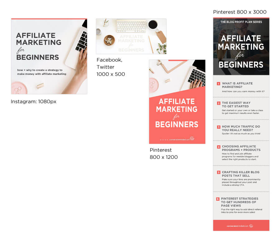
- Twitter + Facebook: 1000 x 500 (I use this image as the Featured Image on my blog post)
- Instagram: 1080 square
- Pinterest: 800 x 1200 (this is the first image on my blog) and a second, longer pin
Here’s an example of the image size templates I use:
 I know you’re probably thinking Do I really need 3 or 4 different image templates? I don’t even have time to create one!
Really, you don’t need all of these, but there are a few reasons these work for me. First off, these are the social media platforms I’ve decided to build a following on. Second, I like changing up my Twitter and Facebook images 🙂 And last, I’ve made it a habit to create 2 pins for every post, so that’s why that extra pin is in there. If you’re curious about that, this post explains why.
So that’s what works for me. What you create is really a matter of preference. You may decide to create templates only for Instagram and Pinterest, then use the same square image for Facebook and Twitter (keep in mind that part of your image will be cut off in the feeds if you do this).
Or, maybe you’ll want to be laser-focused on Pinterest at first. That’s perfectly okay. Actually, better than okay… Pinterest is the bomb for traffic so starting here makes sense, you savvy blogger, you!
Related: Social Media Image Sizes [Profile Pics, Cover Photos & Shared Images]
Do you have to use Photoshop?
Absolutely not! Photoshop is just my preference. I’ve read that you can do amazing things with Canva, especially the paid version. I think Canva will even resize the templates for you. Done, done and done!
The reason I prefer Photoshop is that I’m a graphic designer and have used it for 20 years. Let’s just say Photoshop and me are BFFs 🙂
If you’re unsure whether to use Canva or Photoshop, I recommend looking into Canva first. Even their free version is jam-packed with design features and starter templates that will make you look like a design pro even if you don’t feel like one yet!
If you’re still curious about Photoshop, here are a few reasons why I love it:
- Working in layers makes it very easy to tweak any element of your image
- Endless creativity with images, textures, overlays, and fonts
- Advanced controls over font spacing and image alignment
- There are times (like most!) when my image is almost perfect but not quite. I can easily retouch the photo to make it work better
- Designing is fun, easy, and rewarding!
- I could go on and on…
Ok, speaking of design, this is just one of those things that we can’t overlook, because it will have a huge impact on your traffic and subscribers. The more successful your content is visually = the more your business will grow. Make sense?
I’ve picked up quite a few design tips through years of trial and error, and I’m going to save you all of that time right now!
2) A FEW QUICK DESIGN TIPS
Color
Bright colors like oranges and reds get more shares, saves and repins. Think light, bright, poppy and you’ll be good. What this means is that any background images you use are open and airy. Whatever you do, don’t go dark! That’s where I started and darker images just don’t grab people’s attention the way that the brighter colors do.
Here’s an example of a dark image:
Now I was right on track with the orange color in there, but the dark background pushes it back and makes it hard to notice in feeds. We want the exact opposite effect, so stick with lighter/brighter backgrounds and orange/red accents if you can.
A big bonus here is that people click on red the most, so your images will get more saves, repins and click-throughs.
Related: How to Choose Colors That Will Make Your Brand Stand Out
Balance + Hierarchy
The other thing to pay attention to is the overall balance between elements. This is especially true with background images. Make sure things aren’t bumping into each other and distracting people.
Your overall goal is to make people focus on something and that, friends, is your blog title – not some fancy pants image in the background. Think of it like your text is the star of the show and graphics/images are just supporting actors and actresses.
Now, I get that design can be a delicate balancing act. It seems so much easier than it is, right? For instance, in the pin example above, my text gobbles up the entire pin! Talk about stars and their egos!
What happens when you make your fonts too big like that is that the image gets crowded and noisy. People won’t know what to focus on. Instead, leave some “white space”. What you’re really looking for is that fine line where your text stands out enough to grab people’s attention, but not so much that it ruins the show and clutters up your pin. Make sense?
Aahhh, this is so much better:
You see how this is more open and airy? Now we’re talkin’!
Fonts
It’s just too tempting to see beautiful fonts like these and want to use every single one of them in your image. Let’s resist, friend! This is definitely one of those things where less is more. Of course, you’re going to want to play with fonts, and you should. At some point, though, make sure you narrow down your choices to just 2 or 3.
Everything we’ve just covered here is part of creating a kickin’ brand. You want that when people see your images on different platforms, they instantly recognize them (and you!) because your brand is harmonious and cohesive everywhere.
Related: How to Create a Branding System for Your Blog and Business
Still with me? Great, let’s do this!
3) Photoshop Tools and Palettes
Before you create an image template, you need to understand the Photoshop workspace a bit, specifically the tools palette and layers palette.
First up, the tools palette
These are some of the tools you’ll use most frequently:
 Now, you’re probably wondering what each of these tools does, so let’s get that out of the way right now:
The Move Tool – Pretty obvious, right? This is the tool you can use to move things around on your canvas. So if you’re on a layer and you want to move it but can’t, that’s why!
Marquee – When you want to tweak something on one of your layers, use this tool…
…or, use this one:
Lasso – Works the same as the marquee tool, but you can actually draw your selection area with the lasso. This is great when you want to get very specific and just change a piece of an image, for instance.
Eyedropper – Such an awesome tool! See a color in an image or graphic you want to use? You’re gonna love this. Just drop the eyedropper tool on it and that color will become active.
Eraser – To erase things!
Text – Add text to your canvas. Tip: before you start typing, drag the text tool to create a text box first. This will make resizing text so much easier. Pinky swear.
Shape – Create rectangles, rounded corners, circles and more with this tool. To see the other shapes, just hover over that little triangle in the bottom right corner.
Now that we have our tools covered, let’s start creating!
Over to the layers palette…
The layers palette looks a bit like the image below. I’m using a verrrry old version of Photoshop, so your workspace probably looks different than mine, but everything’s still in the same place, so we’re all good.
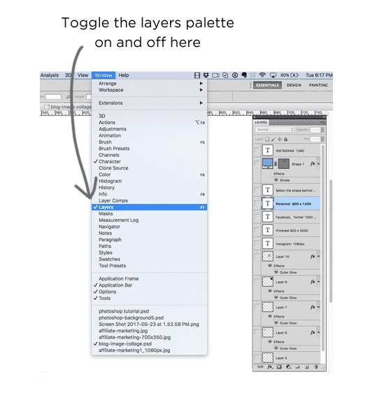 To build your template, you’re going to have 3 different groups of layers. Say whaaa? Stay with me here, I’ll going to clear it all up for you right now. Time to build a template!
4) Finally! Let’s create an image template
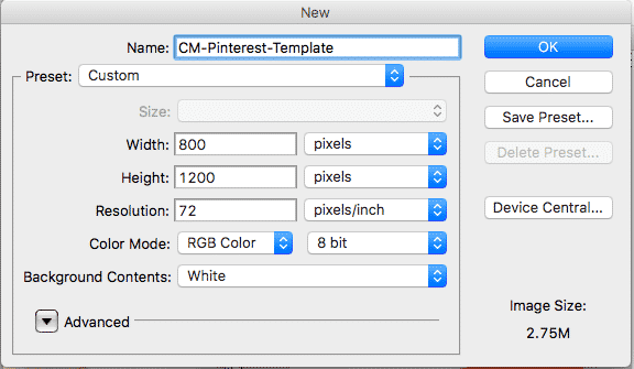
For this tutorial, we’re creating a Pinterest template that is 800 x 1200px. The reason I’m focusing on Pinterest is that this is where the bulk of your traffic will come from, so it makes sense to nail that platform first.
Before we dive in, be sure to download this template so you can tweak it with your own amazing design: Photoshop Pin Template.
First, create a new document
Our first step is to create a new document. Make sure you’re working in pixels, at 72 pixel/inch, and the color mode is RGB color. I like to append my file names with the word “template”, like this:
Now I know that a blank canvas can look intimidating, so let’s fill this bad boy up with some creative genius, k? You’re probably thinking where do I even start? How do I start filling up this *$#@! screen with pieces I can use over and over?
This is where the layers palette comes in. That’s where all the components of your image will live, and each one is “layered” on top of the others. So any element layer #1, for instance, will appear behind layer #2, layer #3, and so on. Think of it like building blocks!
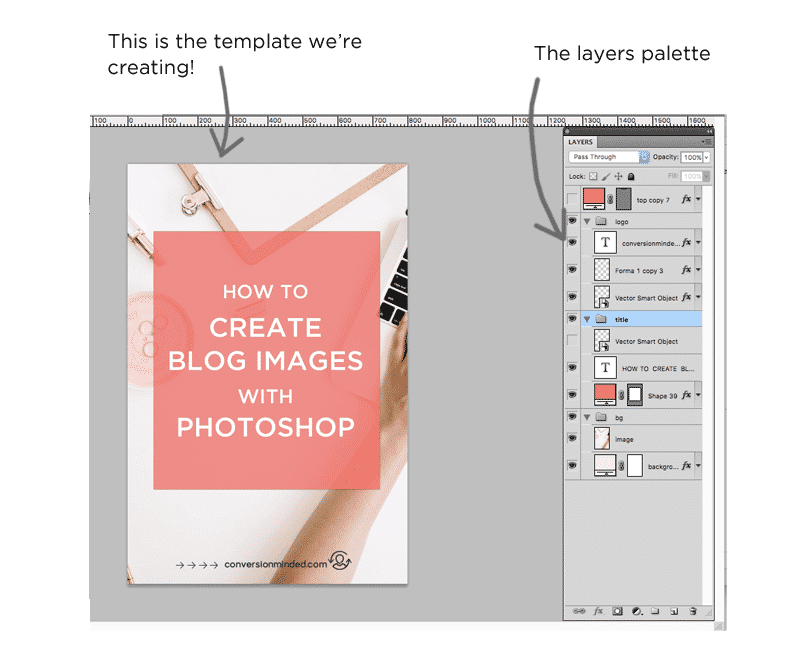 For our template, we need 3 groups of layers. We’re going to have a background (layer group #1), some text (layer group #2), and our logo/branding elements (layer group #3).
Uh, why am I calling them layer groups? Great question! Each element is going to have its own layer, and then those layers will be grouped according to function. You will probably be working with more than one text box, more than one image, and more than one graphic. Groups are a simple way to organize our layers into something that makes sense:
- Logo/branding
- Text
- Background
Before we even create a layer group, though, we need to create our first layer. Let’s start by creating a background.
Next, create a background layer + group
To fill your entire background with a color, select the shape tool, fill it with a color and drag across the canvas. This will automatically create a new layer (if you want to change the color, just double click on the layer, like this:
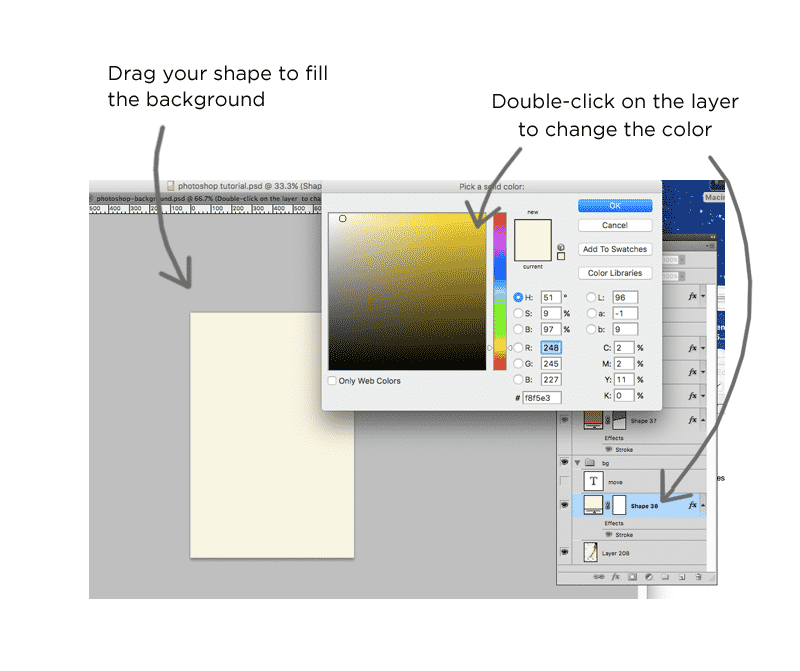 Next, select the shape layer from the layers palette. From the top right corner of the layer’s palette, you’ll see a tiny triangle shape. Select that, and then select “New Group from Layers”, like this:
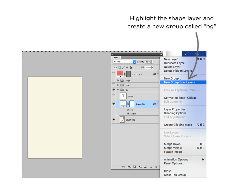 Woop woop! See how we’re starting to create our layer groups? I recommend naming the new layer group “bg” or “background”. Now anything we want to add to the background, say an image for example, would go on its own layer inside the background group. This layer group will always be at the bottom of the layers palette. Text, branding and other graphic elements will go on top.
Next up, add text
You can use any text you like, but for the purpose of this post and because we’re talking about blogging here, let’s assume that the text will be your blog title image, cool?
Select the text tool, and drag it across the center of the canvas to create a text box, then start typing. Whatever you do, don’t leave the text tool without adding text to it! You will have a crazy hard time finding that text box if you do 🙂
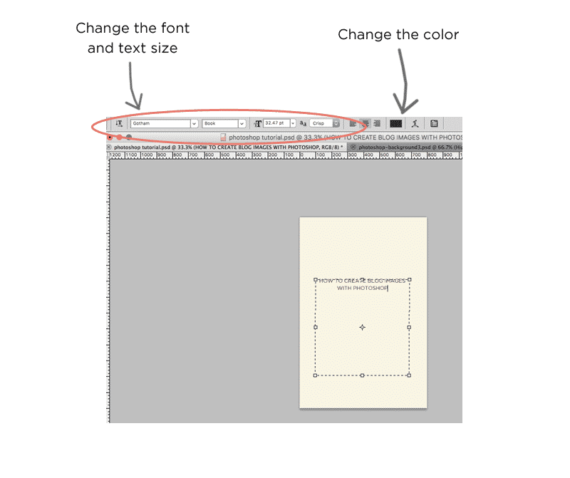 Now the fun starts! It’s so much fun to play with different fonts and get creative. You may want to break your text apart into separate text boxes so that you can have more control over spacing, sizing, fonts, etc. That’s totally fine! I do it all the time.
Just remember to create a separate group layer for all text layers, like we did with the background group layer.
I’m going to say this again because it’s a biggie. You really want to find a style where you use 2-3 fonts (I use Gotham, Thirsty Script, and Angelface) and no more than 2 graphic elements. Then you want to use those same fonts and elements on every image you create! I know it’s so tempting to change fonts on every image, but the problem here is that your brand is going to start to look a bit all over the place, and you want to look consistent and cohesive. If you need some font inspiration, this post is a good read.
Related: How to Create a Style Guide for Your Blog
I think I want to add another shape behind the text so that it really pops. Something like this…
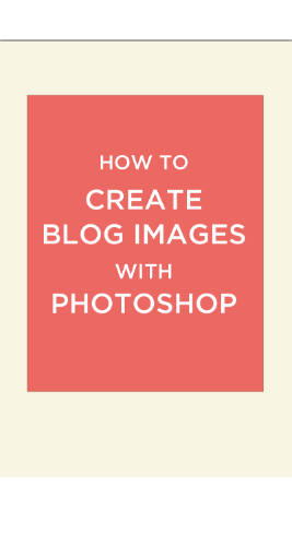 See how our blank canvas is starting to turn into a masterpiece! So exciting!! But it’s still missing that wow factor, no? Let’s see how we can perk it up.
I’m going to add a background image and make the peach box behind the text slightly transparent, which will completely transform the image.
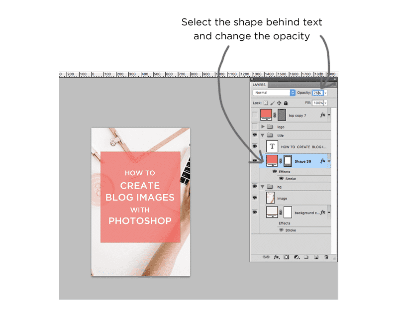 Phew! We’re almost there. Once you have your template styled the way you want, the only thing left to do is to add your logo and branding.
Add your logo and branding
This is so that people start to recognize your images and brand.
If your logo was created in Illustrator, this part is super easy! Keep both Photoshop and Illustrator open, select your logo and drag it over to Photoshop. It will automatically import as a vector smart object, which means that when you click on the logo layer in Photoshop, your logo will open up in Illustrator to edit it there.
I highly recommend adding your URL next to the logo, like this:
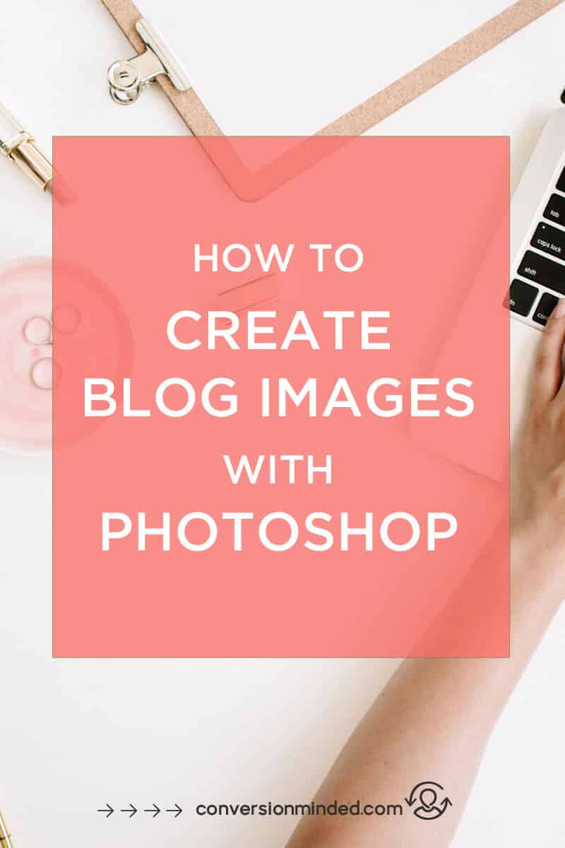 That’s all there is to it. I hope this graphics tutorial has made you fall in love with Photoshop! There is so much you can do once you become familiar with it. You know when you see something in your mind and just wish you could create it? You can with Photoshop! Anything you can imagine, you can find a way to do it. Now you might think the learning curve is too much, and I hear ya! It does take a little more time to master than Canva, but there’s also sooo much more you can do with it!
Have I convinced you yet? Grab the Photoshop template we created here and start tweaking it with your amazing design (free download, no email required!): Photoshop Pin Template
Let’s recap!
- Create image templates for Pinterest and Instagram first. If you like you can add a third size for Facebook and Twitter, or use the square Instagram image.
- Canva and PicMonkey are 2 other photo editors you can use as alternatives to Photoshop. I know Canva comes with preset templates to get you started, but as you’ve seen in this tutorial, turning a blank canvas into a template isn’t as daunting as it seems at first!
- As you create the image templates, remember that you’re building your brand at the same time. Be intentional with your use of color, fonts, and other design elements. And of course, the star of the show is your blog title or text…
- The tools and layers palettes are where the magic happens in Photoshop. Layers can be a bit confusing at first. If you hang in there with it, you’ll be on your way to creating masterpieces in no time. Promise. Just think of layers like a stack of bricks, where one is on top of the other. The bricks that are on the top will cover up the other bricks, so you can’t see them as well as the one on top. The same is true with layers. The top-most layer is going to cover that portion of the image beneath it.
- Work in layer groups with your background as the bottom layer group, text in the middle, and branding on the top. This way your background will always be at the bottom and not covering up another part of the image (if it does, you know that your layers got rearranged somehow!)
- Always add your logo and any branding elements or submarks to your images so that people will recognize your brand.
As you create your image templates, you may find these posts helpful:
- Free Fonts and Font Pairings for Web, Social Media and Blog Images
- How to Choose Colors That Will Make Your Brand Stand Out
- How to Create a Brand Style Guide for Your Blog
- 6 Sources of Free Images for Bloggers
I’m so excited for you guys! I love Photoshop and know you will too. Here’s the link to the template again so you can get started: Photoshop Pin Template.






I love this before I knew about Canva I planned on working on my photos with photoshop as I have some education with it, but could never find many tutorials of the best way to go about it.
I’m so glad it’s helpful… Canva’s great but I love how creative you can be with Photoshop!
great guide! Who needs Canva when you can do this.
Thanks again, this is getting shared!
Hi Ike, Thanks! I agree, Photoshop or bust… I have to admit after writing this I’m tempted to try Canva to see how far I can push it 🙂
These tips and suggestions are really good. I currently use Canva, but I must try Photoshop. It’s the “original”.
Hi Nakeya, thanks for your comment!
Great info! Loved these design tips
Thanks, Josh! Glad they’re helpful.
I love playing with photoshop!
It is so fun and addicting too!
Very well written post. It will be beneficial to anyone who utilizes it, as well as me. Keep doing what you are doing – looking forward to more posts.
I really need to show you that I am new to writing and utterly adored your website. Probably I am inclined to remember your blog post . You literally have great article content. Like it for expressing with us all of your blog write-up
After I initially commented I appear to have clicked on the -Notify me when new comments are added- checkbox and from now on each time a comment is added I get four emails with the exact same comment. Perhaps there is a means you can remove me from that service? Thanks!
Thank you so much for this! Keep it up with the patiently explained tutorials and don’t get discouraged by no comments on your posts.
Thanks for the encourage, Michel. Glad the post was helpful!